Developing and actually using a graphical user interface (GUI) are two sides of a coin. As a software developer, have you ever wondered how users of your application are getting along with the GUI you created for them?
Someone knowing an application and its domain inside out has certainly a different view than someone else who is just trying to take his first steps. This article shows how to improve your GUI with the help of usability tests by an example.
The challenge: designing a supportive user interface
If you are aware of how a suboptimally designed GUI might hamper the user: congratulations! However, how can you find out which of several possible user interface variants supports the user experience best? Your own experience in the field will not necessarily contribute a good piece of advice, because quite likely you are professionally blinkered – ironically due to your very experience.
You need a method that offers a lot of insights and can help you make the right choices. Such a method is to sketch a few different GUI variants and have potential or actual users check them out. You don't need to implement these variants in your software. A wireframe tool to set up some mockups is sufficient, preferably with some scriptable interactivity.
A wizard page for Xtext
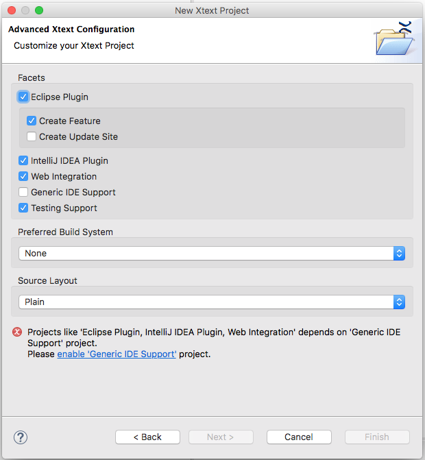
Our case deals with a wizard page for Xtext, a tool for creating domain-specific languages and associated language infrastructures. Don't worry, you do not need to understand in detail what Xtext is and what it does to follow this use case and the basic principle behind usability tests. Suffice to know that Xtext is Eclipse-based, has a wizard to create a new Xtext project and that this wizard includes a particular page to configure some advanced options for a new Xtext project. Fig. 1 shows the implementation of this dialogue in the current Xtext release 2.10.
 Fig.1: Original wizard page
There has been some discussion going on among Xtext core developers on whether this wizard page's design really satisfies users' needs or not. There wasn't a clear conclusion, so itemis' usability experts were asked to investigate further and run a usability test on the current GUI and some alternatives.
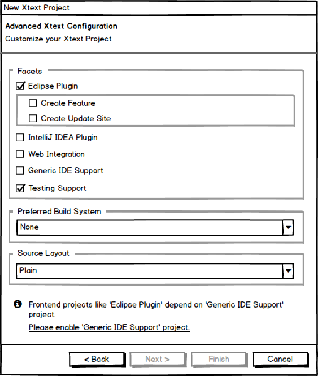
They used Balsamiq Mockups to draw wireframe models of the original wizard page and two alternative versions. Balsamiq Mockups is able to mimic some dynamic behavior. You can configure it e.g. to toggle a certain option from disabled to enabled state if some checkbox has been checked. This is really nice, because this way users can play around with mockup interfaces and get a more realistic impression of how the real implementation would behave. Fig. 2 shows a wireframe version of the screenshot in fig. 1.
 Fig. 2: Wireframe of the original user interface (variant 1)
Running usability tests
In the relaxed atmosphere of a usability dinner, five software developers were asked to perform a simple task with all three user interface variants: creating a new Xtext project with support for an Eclipse editor front-end. The participants had none to moderate Xtext experience and none to senior expert level Eclipse experience. The "New Project" wizard or at least the “Advanced Xtext Configuration” wizard page was new to all of them.
While performing their task, they were asked to think aloud and comment on what they see, what they like, what they dislike, what irritates them etc.
Hidden option dependencies
The most prominent test result: All users stumbled over an unexpected dependency between wizard options. The background: If you want to support a front-end in your Xtext project you have to check "Generic IDE Support" first, and then select the kind of front-end you want, i.e. Eclipse Plugin, IntelliJ IDEA Plugin or Web Integration. By default, "Generic IDE Support" is preselected in the wizard. However, the user could get into a situation where the option is disabled, because e.g. he unchecked it inadvertently.
No user was able to spot this dependency by just looking at the wizard page. Everyone at first checked "Eclipse Plugin" – only to run into an error message shown at the bottom of the page, see fig. 1 or fig. 2. Not everyone noticed that message immediately and not everyone was immediately able to tell what to do next. Sure, sooner or later everyone managed to find out that he had to enable "Generic IDE Support" first in order to activate Eclipse support. However, this is a severe usability issue, because everyone got irritated by the unexpected dependency and by the "unavoidable" necessity of dealing with an error message.
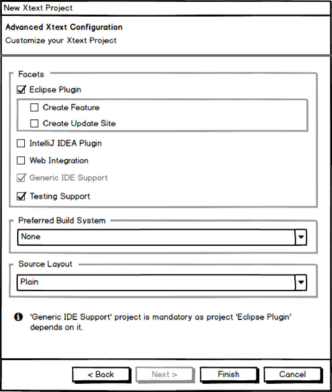
 Fig. 3: Automatically setting the "Generic IDE Support" option (variant 2)
A second wizard page variant (fig. 3) copes with this deficiency. It looks almost identical to the first version, but its dynamic behavior is different: If the user checks "Eclipse Plugin", the "Generic IDE Support" option is automatically checked, too, i.e. the user interface essentially does by itself what the user would have to do otherwise. "Generic IDE Support" is also disabled so it cannot be unchecked as long as "Eclipse Plugin" or one of the other front-end options are checked. Users liked this behaviour very much and had no issues fulfilling their task. This holds even though the dependency was still not explicitly visible in the GUI.

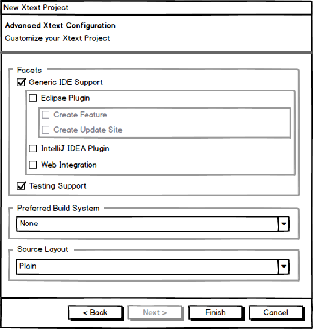
Fig. 4: Making option dependencies visible (variant 3)
A third variant of the wizard page visualized the options in a dependency hierarchy (fig 4). Users were now able to see that
- "Generic IDE Support" is a requirement for "Eclipse Plugin", "IntelliJ IDEA Plugin", and "Web Integration", and
- there is no dependency between IDE issues and the remaining options like e.g. testing support or source layout.
On the other hand some users found it confusing that they could not select "Eclipse Plugin" right away, but instead had to check "Generic IDE Support" first.
Overall, users felt that variant 2 supported them best, followed by variant 3. Nobody preferred the original variant 1.
Explain your options!
As an additional result it turned out that users don't necessarily understand what the options offered by the wizard actually mean. Our testers had quite different ideas – or no idea at all – on what "Eclipse Plugin", "IntelliJ IDEA Plugin", "Web Integration", "Generic IDE Support", "Testing Support", "Preferred Build System" and "Source layout" might mean. The "Source Layout" option really took the cake: Not a single user explained it correctly without seeing the available options. As a consequence, the developers should add tooltips to the options. These tooltips could explain each option in some detail, link to the appropriate section of the documentation or even include it.
Bottom line
Consider drafting some alternative GUI variants or have usability experts do that for you and run usability tests! It will be a benefit to your users and might help propagate your software.
And please don't take for granted that everyone knows the terms you are familiar with! Explain them to your users!
Comments