
Change requests are common in development projects. When we get the list of customer requirements at the beginning of a project, we all know that some of these requirements will change later – and often we have already implemented and tested the requirement that should be changed now. In this post I will explain how visualizations of traceability data can help us to keep the overview in this case.
Change requests lead to a lot of manual work
When a change request occurs, this implies a lot of work for the project team:
- We must check which status the requirement that applies to the change request has currently. If the work on the requirement has not started yet a change request is easy to realize. However, mostly we already have created some work products and we need to find out which ones.
- We must figure out which of the artifacts related to the requirement will be affected by the change. This comes along with a lot of manual work – especially if these artifacts are filed in different tools.
- We must analyse how much effort it would be to realize the change request.
- We need to change the related artifacts.
- After the change we must check if all links between the changed artifacts are still valid (e.g. test cases must be added, deleted or re-written). This means we have to navigate through different tools again to check all artifacts.
Visualize all linked artifacts for an easy impact analysis
In short: We need to do an impact analysis – ideally easy and quick. A visualization of all linked artifacts can help us with that. Based on such a visualization we can identify the artifacts related to the changed artifact directly and find out how many and which artifacts we have to analyse and change easily. This gives us a first indication of the change effort.
A visualization also allows us to browse through the current traceability model. We can navigate to the linked artifacts in their original tools quickly to avoid cumbersome manual search effort. As we can analyse the size and complexity of the related artifacts in the different tools, this quick navigation helps us to concretize the assumption of needed effort.
Visualizing link data with YAKINDU Traceability
YAKINDU Traceability allows us not only to access and link artifacts across various tools, it also uses the benefits of visualizing link data. The tool provides two different visualizations for different purposes: a tree and a graph.
Visualization in a tree structure
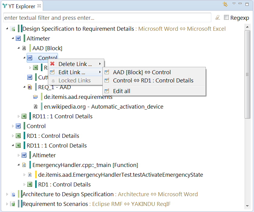
The "YT Explorer" shows us all existing links in a tree structure. We can expand the different nodes in the tree to identify all linked artifacts to give us a complete overview on all links in our project. For a better orientation we can choose between different groupings in the tree. We can:
- group links based on the type of artifacts, e.g. requirements, test cases, test results...
- group links based on link types, e.g. links between test cases and test results, between sourcecode and test cases...
- group artifacts based on their resource
- etc.
It is also possible to search for specific artifacts or patterns of artifact names to filter the number of shown links based on individual purposes. The “YT Explorer” also offers means to change the shown links. In that way we are able to delete one or several links directly to change the link end(s) of specific links or to replace an artifact in the traceability graph completely. In that way links can be changed easily if they are not valid any more.
Visualization in a graph
The "YT Overview" displays all links of the artifact we selected in a graph visualization. It is possible to change the depth of the shown links: for example we can show only the direct links of the selected artifact or also links of linked artifacts. By selecting single nodes of the graph we are able to focus on artifacts and their links. This allows us to browse through the whole traceability model.
Easy tool navigation with a simple double click
The visualization can be the starting point for an easy tool navigation. With a double click on the displayed artifacts they open in their original tool directly, so we can make our changes easily.
Every view in YAKINDU Traceability that displays artifacts provides this double click functionality so navigation gets more comfortable.
Visualizing links bring several benefits
The visualization of link data in YAKINDU Traceability helps us to display all existing links in the project – so it provides a good overview on the current work status. By figuring out the effort needed to realize a change request it supports us especially with the impact analysis. Also every individual role in the project team is supported – they can find out easily which concrete artifacts they need to adapt.
Of course YAKINDU Traceability offers other advantages for the traceability management which we are looking forward to present personally.

Comments