
What do these things have in common, you might ask? The answer is both simple and intriguing: I’m talking about a “Usability Speed-Testing”!
Speed-Testing for rapid user feedback
A good usability and a great user experience are important factors for the itemis statecharts team when developing YAKINDU Statechart Tools. But getting valuable user feedback can be time- and cost-intensive – except you are taking part in a Usability Speed-Testing.
Never heard of such an event? Don’t worry, let me clear things up for you. The Usability Speed-Testing is also known as Usability Speed-Dating or Usability Dinner. It is a form of event that swept over (like so many things) from the San Francisco/Silicon Valley area and provides tool vendors like us with rapid user feedback about a small section of the tested product. It works like this:
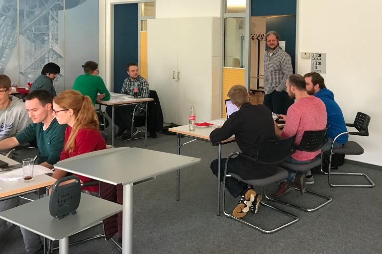
Developers and users of all experience levels gather together in a casual setting in a relaxed atmosphere. Pizza is served and everybody can grab a drink if they want.
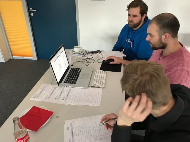
In 15 minutes usability test runs the testers rotate over each product or tool – speed-dating-like. On this way developers gather valuable insight from real users but with less expenditure of time and money.
If you want to learn more about the concept check our german blog post.
User feedback for YAKINDU Statechart Tools
Rapid and valuable user feedback? No wonder that YAKINDU Statechart Tools was amongst the applications on the testing bench when we at itemis hosted our last Usability Speed-Testing. Our testing scenario aimed at the onboarding process that a first-time user would go through, experiencing the first contact after downloading the tool.
We looked for insight concerning topics like
- What is the general first impression of YSCT for a new user?
- Are our examples and tutorials accessible and easy to understand?
- Is the UI intuitive enough and do the wizards provide the help we want?
- How are new users interacting with the graphical model editor?
- Can new users quickly grasp the simulation feature of a small scale model?
You are interested in what we found out? Here are some insights for you
Welcome Page and Example Wizard improved
Being able to quickly grasp the core features is key for every application. Therefore, we reworked the welcome page and the example wizard to be more intuitive towards first time users. During the testing sessions our testers confirmed the improved usability by having no problem to find and select a suitable quick start example.
Sneaky Simulation View is too hard to notice
When we gave our volunteers the task to simulate a simple model, we noticed a common issue where our users had trouble to find the simulation view, which is needed to trigger the transitions from state to state. At the moment it is tucked away on the far right of the screen and too unobtrusive to be recognized as an active panel.
“Oh wow, I can type here...”
We noticed a similar issue with the DSL editor. While it is in the center of the screen, just left to the graphical editor, some of our testers had difficulties to recognize it as an editable textbox. This was due to not conforming to what users expected such textboxes to look like. Only after a double-click the visual appearance changes to what is a more expected look and feel, with a monospace font and syntax highlighting.
Quick but valuable results
When the hosting team waved the checkered flag, we had gathered insights from five completely unique testers, ranging from a senior eclipse expert to a genuine first time user. While some of the feedback was expected, we also took away some great new bits and pieces. Feedback like this is important to us because it helps us to prioritise our efforts to make YAKINDU Statechart Tools an even better product.
Thus the Usability Speed-Testing was a great event for us – we had a blast!
You haven't tried our YAKINDU Statechart Tools? Then check our free 30-days-trial.

Comments